

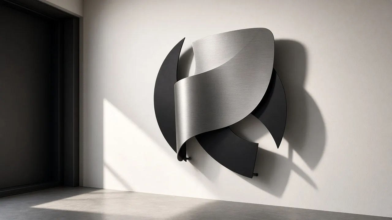
Metal on the wall used to mean either industrial leftover or ornate scrollwork. What I keep noticing in Brooklyn walk-ups and gallery-adjacent living rooms is a third lane: contemporary metal wall art that behaves like furniture for the eye, graphic, shallow, and oddly calm.
This piece is about how those forms work in real rooms: material choices, scale, and placement that survive daily life instead of looking staged for one photograph.
Why Metal Feels Current Again
I’d describe the shift as a reaction to soft maximalism. Soft sofas and linen everywhere needed a hard counterweight. Metal gives you edge without demanding a full industrial renovation. The distinction matters because cheap printed metal panels and actual sculptural pieces photograph similarly online and feel nothing alike in person.
When I first started paying attention to this category for culturizm, I kept mistaking product photos for sculpture. Depth, weld quality, and how a piece throws shadow are the tells. If it looks perfect only under ring lights, it will look thin on a cloudy Tuesday afternoon.
If you are mapping the broader design language around this, my notes on contemporary design sit next to this topic more cleanly than shopping roundups do.
Forms That Carry a Room
Form is where taste shows. Circles and cones read theatrical. Rectangles and bars read architectural. Botanical cutouts read softer. None of those are wrong. What actually sets a piece apart is whether the silhouette still makes sense when you are not staring at it.
Sculpture Over the Table
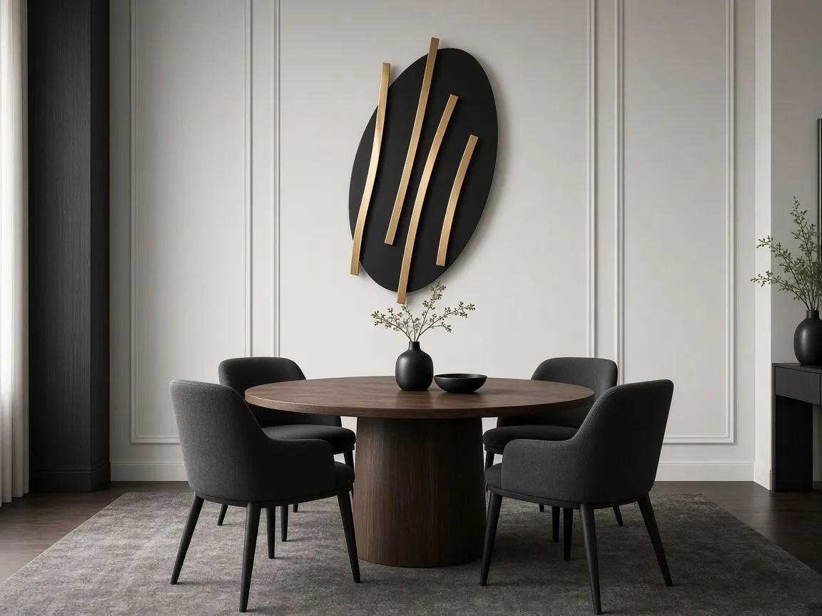
Most people hang the quietest print above a dining table and hope the tableware does the talking. I’d rather see a metal piece that casts a real shadow when the pendant light turns on. What sold me on sculptural discs and bars in this zone is how they stay readable from a standing conversation across the room. Flat posters disappear the moment wine glasses crowd the table.
Mirrors With Metal Edge
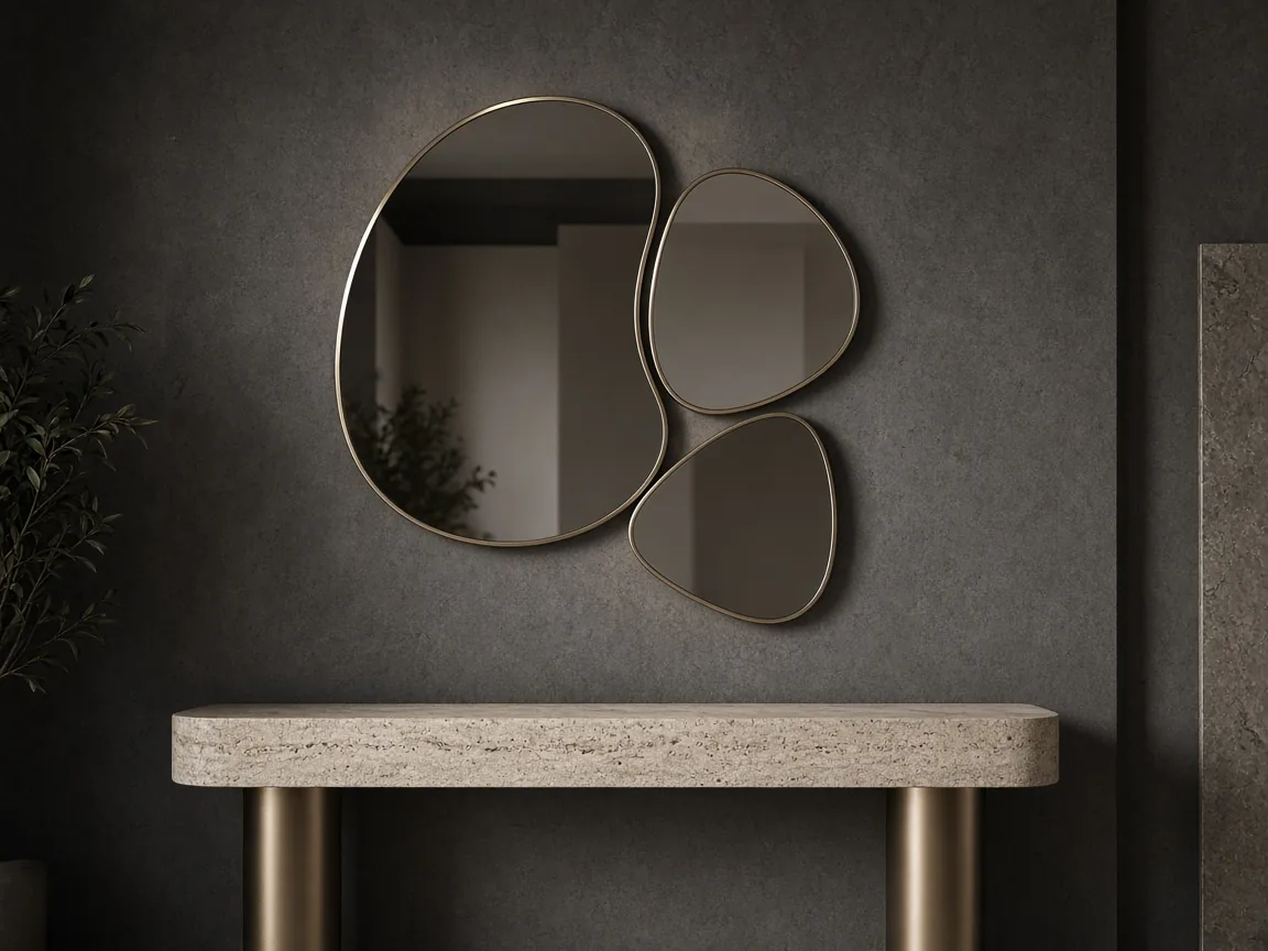
Overlapping metal-framed mirrors sit in a weird category between art and utility. I like them in entryways where you want bounce light without a full gallery wall. The mistake I see: treating every lobe as a perfect reflection. Smoked and champagne tints keep the composition from turning into a vanity mirror farm.
Materials, Finish, and Mood
Finish is the quiet argument. Matte black absorbs light and reads graphic. Brushed brass throws a warmer highlight that pairs with oak and linen. Polished chrome amplifies cool palettes and can look clinical next to soft upholstery. I pick the finish the way I’d pick a belt: it should conclude the outfit, not compete with it.
Mixed metals can work if one finish leads. Two equal brass and chrome accents in the same sightline usually look unresolved. Lead with black structure, then let one warm metal show up as punctuation. That is the rule I use when a room already has lamp bases and faucet hardware fighting for attention.
Geometry in Soft Rooms
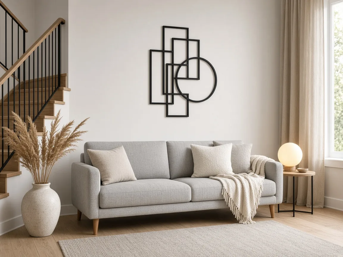
When a living room is already plush, I look for geometry that is almost severe. Black rectangles and circles on a pale wall give the sofa something to answer. Most people default to another soft canvas here. I’d rather the metal stay lean so the textiles can stay soft without the whole room going mushy.
Where Placement Actually Matters
Height is the boring detail that ruins good pieces. Center of the artwork around eye level when standing, then adjust for sofa backs. Wide botanical frames need breathing room between squares; cramped spacing turns them into a sticker sheet.
Scale relative to furniture matters more than square footage. A tiny metal accent above a long sofa reads like an afterthought. A piece that spans roughly half to two thirds of the sofa width usually settles the wall. Measure before you order. I have returned more art for being timid than for being bold.
Botanicals Without Clutter
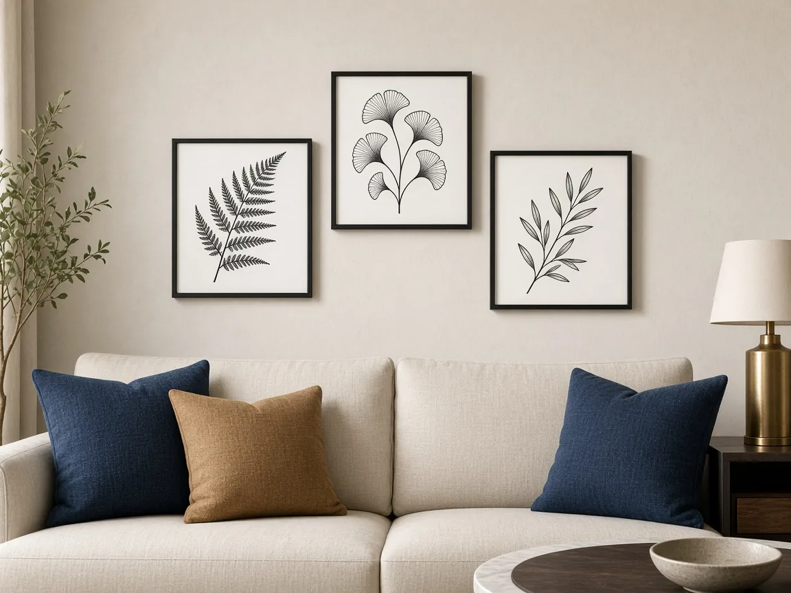
Leaf cutouts in metal can tip into theme-park decor fast. What keeps them contemporary for me is sparse hanging and a sofa palette that does not also shout tropical. Indigo and ochre pillows work; a jungle print throw on top of jungle metal is how the idea dies.
For adjacent living-room thinking beyond metal alone, I keep returning to contemporary living room ideas when the whole seating zone needs a reset, not just the wall.
One more Brooklyn observation: thin loft walls punish heavy pieces. If your landlord renovation is mostly drywall theater, choose lighter alloys or mount to studs you can prove exist. Contemporary metal wall art should look decisive, not like it is one party away from a plaster scar.
Worth understanding before you buy: shipping dents happen, and returns on large metal pieces are miserable. Ask about packaging, check corners the day it arrives, and photograph any damage before you hang anything. Romantic unboxing videos skip that part for a reason.
Music and metal as cultural cousins is a stretch for interiors, but if you want the word “contemporary” outside the apartment, contemporary music artists is where I park that curiosity so this post can stay about walls.
FAQ
What counts as contemporary metal wall art?
I treat it as metal pieces that read as current design language: clean geometry, mixed finishes, or botanical cutouts that feel intentional rather than souvenir-shop scrollwork. Age of the alloy matters less than how the form talks to the room.
Does metal wall art work in small apartments?
Yes, if you keep depth shallow and let negative space do half the work. One strong silhouette above a sofa often reads cleaner than a crowded gallery wall of tiny frames.
Which finishes feel most contemporary right now?
Matte black, brushed brass, and smoked mirror edges are the trio I see holding up. Highly polished chrome can work, but it fights soft textiles unless the rest of the room is already cool and graphic.
How do I hang heavy metal pieces safely?
Find studs or use rated anchors, and measure twice for horizontal balance. If a piece cantilevers, I prefer two mounting points even when the hardware suggests one.